Operator playbook
Product Collection Pages: Give Your Campaign a Clear Place to Choose
Build a product collection around a real customer decision, with a small-entryway example, a page-to-post worksheet and practical checks for useful search destinations.
 Soren Vex · · 11 min read
For: US and UK small retail brands that own a storefront and want a useful destination for a campaign covering several products.
The short answer
Define why the products belong together, show the distinctions that change a choice, and link directly to the relevant details. Keep the collection and its promotional content aligned as the range changes.
A useful product collection page explains why these items belong together and helps a visitor choose where to look next. Start with one customer task, include products that genuinely serve it, and make their differences visible. The campaign should send people to the same choice it promises.
For a small shop, this can turn a broad invitation such as “explore our storage range” into a more helpful one: “find a place for the things you drop by the door.” The page then has a specific job to fulfil.
Outcome and prerequisites
Prepare one collection brief, a clear page opening and a map from campaign messages to the appropriate product details. This suits a business with several relevant products, current photographs and a storefront it can maintain. One product does not need a collection merely to make a campaign look larger.
Gather confirmed specifications, availability, product URLs and any conditions that affect the choice. Use the prices, currency and fulfilment terms that apply to the market you serve. Do not let a shared campaign imply identical US and UK availability.
Shopify's collections documentation describes grouping products by category, theme or customer intent, then displaying a gallery that leads to individual product pages. Its controls are changing as a new collections model rolls out, so use the options actually available in your store. The planning method here also works on other storefronts.
A usable answer first
Build the collection around this sequence:
Shared task → inclusion rule → useful differences → product detail → current campaign invitation.
Write the inclusion rule before choosing the hero image. “Products that help organize small everyday belongings near the entrance” gives an editor something to check. “Our favourites” supplies much less guidance when the range changes.
Then identify the differences that affect a customer's next click. Does the product sit on an existing surface or attach to a wall? What does it hold? What must the customer check before ordering? These questions create routes through the range without requiring a long buying guide above the products.
Keep each answer self-contained. A product card should name the item, show a representative image and make its destination clear. A poetic collection name can add character, but it should not carry the whole explanation.
Worked brief
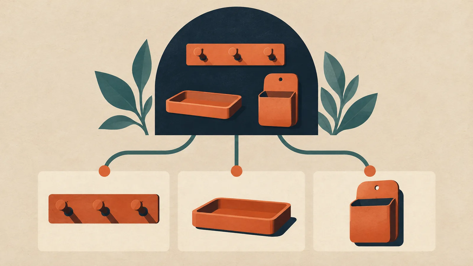
Imagine a fictional independent homewares shop with a hook rail, a shallow key tray and a wall pocket. The owner wants a collection called “Everyday entryway storage.” Its voice is calm and practical. The campaign addresses small belongings that accumulate near the door.
The inclusion rule is narrow: each item must provide a place for an everyday belonging at the entrance. A decorative vase might look good in the photograph, but that alone does not earn it a place in this collection. A large hallway bench may deserve a different page if the current promise is small accessories.
A proposed opening is:
Give the things you reach for by the door a regular place. Compare a hook rail, a key tray and a wall pocket by what you want to store and where you can put it. Check each product's dimensions and installation details before choosing.
The three routes are practical rather than hierarchical. The tray needs a suitable surface. The rail and pocket need the customer's own installation check. No option is labelled “best for every home,” and the page does not invent load ratings or dimensions.
The cover shows the collection branching into three matching product routes. It illustrates this structure; the generated objects do not establish what a real shop sells.
Steps and checkpoints
- Define the shared task. Input: actual customer questions and the current range. Output: one sentence explaining the collection's purpose. If the products have no meaningful relationship beyond being available, reconsider whether a new collection is useful.
- Write an inclusion rule. Input: the task and each product's verified use. Output: a short include/exclude decision for every candidate. Remove decorative props from the product list unless they genuinely meet the rule.
- Choose a useful order. Input: the main distinction customers need to understand. Output: a visible route through the options. For the example, show surface storage and wall-mounted options clearly. This is an editorial choice, not a proven conversion formula.
- Connect the details. Input: exact product names and URLs. Output: working links to the information that could change a choice. For the tray, that may be its size; for the rail, it may be mounting requirements. Open each destination on a phone and confirm the photographed version matches.
- Make the collection reachable. Input: the store's navigation and related pages. Output: a sensible browsing route. Google's ecommerce guidance recommends links from categories to products and notes that Googlebot generally does not submit searches into a site search box. Ask whoever maintains the store to check crawlable links as well as the visible journey.
- Review the campaign against the live page. Input: every planned invitation. Output: a destination that delivers its scope. “Compare ways to organize the doorway” can lead to the collection. “See this tray's measurements” should lead directly to the tray details when possible.
Do not create a new page for every wording variation. First check whether an existing collection already answers the task. Improve that destination when the underlying choice is the same.
Reusable worksheet
Use this original page-to-post map to connect selection, evidence and promotion. The examples describe hypothetical content, not observed results.
| Product route | Detail to check | Useful campaign angle |
|---|---|---|
| Key tray on a surface | Size and available surface space | Give keys a regular place |
| Hook rail on a wall | Mounting details and intended use | Compare a wall-storage option |
| Wall pocket | Dimensions, access and installation | Find a place for small loose items |
For your own brief, fill in: collection purpose; inclusion rule; product; difference that matters; verified detail; representative photo; product URL; campaign invitation; change trigger; reviewer.
Add a simple acceptance check: can someone explain why the three products are grouped together, choose one to investigate and find the detail that could rule it out? If they cannot, improve the page's labels or organization before writing more promotional posts.
Our product dimension guide helps prepare the size information those routes may need. Keep the collection concise and let the detail page answer the deeper fit question.
Failure modes
The collection becomes a second gift guide. A gift guide explains a recommendation for a recipient or occasion. A collection provides a maintained way to browse a relevant range. Our holiday gift-guide playbook covers recommendation writing; link the two when each has a distinct job.
Every item sounds interchangeable. Replace repeated adjectives with a useful distinction: placement, intended contents, installation or another supported difference. If no difference matters to the customer, simplify the choice instead of inventing one.
The campaign outlives the range. Before a scheduled promotion, check that the page still provides the promised choices. Mark unavailable products accurately and revise invitations that depend on them. Do not quietly substitute a materially different product under an old promise.
Search visibility becomes a promise. Clear structure and usable links help describe the site; they do not guarantee indexing, rankings or AI citations. A collection full of unsupported claims is not improved by adding more search phrases.
From one-off to recurring
Once the collection works, each selection route can become a useful piece of marketing. A post can introduce the shared problem, a visual comparison can explain placement, and a follow-up can show one product's deciding detail.
Try MultiCast when you want those pieces to feel like one considered campaign. Its public product page describes campaign planning, brand voice, your own photographs and per-piece approval. Bring the collection's inclusion rule, checked product details and intended destination into the brief.
The advantage to evaluate is continuity: each new piece can build on the same selection logic while keeping the brand recognizable. Review the output against the current storefront, particularly when an image shows several objects but only one is included in the offer. This guide does not establish that MultiCast creates collection pages or synchronizes inventory.
A document and manual posting can suit a small, occasional collection. A recurring range gives a shared campaign workflow more work to organize. Keep the product decision clear first, then explore more search and discovery guides.
Evidence and updates
Sources checked October 18, 2026. This AI-assisted guide uses MultiCast's fictional Soren editorial persona. Shopify supplies platform documentation, Google supplies crawling guidance, and MultiCast supplies advertised capabilities. The homewares shop, opening paragraph and worksheet are original hypothetical examples; no conversion or search outcome was measured.
The US Google Trends comparison and UK comparison used “collection page” and “youtube thumbnail” as Web Search terms over the past year. The collection term had ambiguous related queries and did not establish a recent ecommerce-demand surge. The current partial week was excluded. This article is justified by the practical customer task, not a popularity claim.
Review the page whenever its products or buying conditions change. Recheck the platform guidance by November 18, including which collection controls your storefront actually exposes.
 MultiCastMARKETING, TOGETHER.
Good ideas deserve a consistent campaign.
Bring your next marketing idea to MultiCast. Keep your brand at the center, from planning to publishing.